
Lego build with chrome
Обновлено: 25.04.2024

Build with Chrome, a fun experiment for desktop Chrome users originally launched in Australia, was re-released in 2014 featuring global availability, tie-ins with THE LEGO® MOVIE™, and newly added support for mobile devices. In this article we will share some learnings from the project, especially regarding the move from desktop-only experience to a multi-screen solution that supports both mouse and touch input.
The first version of Build with Chrome was launched in Australia in 2012. We wanted to demonstrate the power of the web in a whole new way and bring Chrome to a whole new audience.
The site had two major parts: "Build" mode where users can build creations using LEGO bricks, and "Explore" mode for browsing the creations on a LEGO-ified version of Google Maps.
Interactive 3D was essential to give users the best LEGO building experience. In 2012, WebGL was only publicly available in desktop browsers, so Build was targeted as a desktop-only experience. Explore used Google Maps to display the creations, but when zooming close enough it switched to a WebGL implementation of the map showing the creations in 3D, still using Google maps as the baseplate texture. We hoped to build an environment where LEGO enthusiasts of all ages could easily and intuitively express their creativity and explore each other's creations.
In 2013, we decided to expand Build with Chrome to new web technologies. Among those technologies was WebGL in Chrome for Android, which naturally would allow Build with Chrome to evolve into a mobile experience. To get started, we first developed touch prototypes before questioning the hardware for the "Builder Tool" to understand the gesture behaviour and tactile responsiveness that we may face through a browser in comparison to a mobile app.
We needed to support devices with both touch and mouse input. However, using the same UI on small touch screens turned out to a suboptimal solution because of space constraints.
In Build there is a lot of interactivity going on: zooming in and out, changing brick colors, and of course selecting, rotating, and placing bricks. It's a tool where users often spend a lot of time, so it's important that they have quick access to everything they use frequently, and they should feel comfortable interacting with it.
When designing a highly interactive touch application, you will discover that the screen quickly feels small and the user's fingers tend to cover a lot of the screen while interacting. This became obvious for us when working with the Builder. You really have to consider the physical screen size rather than the pixels in the graphics when doing the design. It becomes important to minimize the the number of buttons and controls to get as much screen real estate as possible dedicated to the actual content.
Our goal was to make Build feel natural on touch devices, not just adding touch input to the original desktop implementation, but make it feel as it was really intended for touch. We ended up with two variations of the UI, one for desktops and tablets with large screens and one for mobile devices with smaller screens. When possible, it's best to use a single implementation and have a fluid transition between modes. In our case, we determined that there was such a significant difference in experience between these two modes that we decided to rely on a specific breakpoint. The two versions have a lot of features in common and we tried to do most things with just one code implementation, but some aspects of the UI work differently between the two.
We use user-agent data to detect mobile devices and then we check the viewport size to decide if the small screen mobile UI should be used. It's a bit hard to choose a breakpoint for what a "large screen" should be, because it's hard to get a reliable value of the physical screen size. Fortunately, in our case, it doesn't really matter if we display the small screen UI on a touch device with a large screen, because the tool will still work fine, just that some of the buttons may feel a little bit too large. In the end, we set the breakpoint to 1000 pixels; if you load the site from a window wider than 1000 pixels (in landscape mode), you'll get the large screen version.
Let's talk a little bit about the two screen sizes and experiences:
The large screen version is served to all desktop computers with mouse support and to touch devices with large screens (such as the Google Nexus 10). This version is close to the original desktop solution in what kind of navigation controls are available, but we added touch support and some gestures. We adjust the UI depending on the window size, so when a user resizes the window, it may remove or resize some of the UI. We do this using CSS media queries.
Example: When the available height is less than 730 pixels, the zoom-slider control in Explore mode is hidden:
This version is served to mobile devices and small tablets (target devices Nexus 4 and Nexus 7). This version requires multi-touch support.
- The Build brick chooser minimizes into a color selector while building.
- We replaced the zoom and orientation controls with multi-touch gestures.
- The Chrome fullscreen functionality is also helpful to get some extra screen real estate.
Modern touch devices have quite powerful GPUs, but they are still far from their desktop counterparts, so we knew we would have some challenges with performance, especially in the Explore 3D mode where we need to render a lot of creations at the same time.
Creatively, we wanted to add a couple of new types of bricks with complex shapes and even transparency -- features that are typically very heavy on the GPU. However, we had to be backwards-compatible and continue supporting creations from the first version, so we couldn't set any new restrictions, such as significantly reducing the total number of bricks in the creations.
In the first version of Build we had a maximum limit of bricks that could be used in one creation. There was a "brick-meter" indicating how many bricks that were left. In the new implementation we had some of the new bricks to affect the brick-meter more than the standard bricks, thus slightly reducing the total maximum number of bricks. This was one way to include new bricks while still maintaining decent performance.
In Explore 3D mode there is quite a lot going on at the same time; loading of base plate textures, loading creations, animating and rendering creations, and so on. This requires a lot from both GPU and CPU, so we did a lot of frame profiling in Chrome DevTools to optimize these parts as much as possible. On mobile devices we decided to zoom a bit closer to the creations so that we don't have to render as many creations at the same time.
Some devices had us revisit and simplify some of the WebGL shaders, but we always found a way to solve it and move forward.
We wanted the site to be somewhat usable even if the visitor's device doesn't support WebGL. Sometimes there are ways to represent the 3D in a simplified way using a canvas solution or CSS3D features. Unfortunately we didn't find a good enough solution to replicate Build and Explore 3D features without using WebGL.
For consistency, the visual style of the creations must be the same across all platforms. We could have potentially tried for a 2.5D solution, but this would ave made the creations look different in some ways. We also had to consider how to make sure creations built with the first version of Build with Chrome would look the same and run as smoothly in the new version of the site as they did in the first one.
Explore 2D mode is still accessible to non-WebGL devices, even though you can't build new creations or explore in 3D. So users can still get an idea of the depth of the project and what they could create using this tool if they were on a WebGL-enabled device. The site might not be as valuable to users without WebGL support, but it should at least act as a teaser and get them involved in trying it out.
Keeping fallback versions for WebGL solutions is sometimes just not possible. There are many possible reasons; performance, visual style, development and maintenance costs, and so on. However, when you decide not to implement a fallback, you should at least take care of the non-WebGL-enabled visitors, explain why they can't access the site fully, and give instructions for how they can solve the problem by using a browser supporting WebGL.
In 2013, Google introduced a new version of Google Maps with the most significant UI changes since its launch. So we decided to redesign Build with Chrome to fit in with the new Google Maps UI, and in doing so took other factors into the redesign. The new design is relatively flat with clean solid colors and simple shapes. This enabled us to use pure CSS on a lot of the UI elements, minimizing the use of images.
In Explore we need to load a lot of images; thumbnail images for the creations, map textures for the baseplates and finally the actual 3d creations. We take extra care to make sure that there is no memory leakage when we're constantly loading new images.
The 3D creations are stored in a custom file format packaged as a PNG image. Keeping the 3D creations data stored as an image enabled us to basically pass the data directly to the shaders rendering the creations.
For all user generated images the design allowed us to use the same image sizes to all platforms, thus minimizing storage and bandwidth usage.
It is easy to forget how much the screen aspect ratio changes when moving from portrait to landscape mode or the other way around. You need to consider this from the start when adapting for mobile devices.
On a traditional website with scroll enabled, you may apply CSS rules to get a responsive site that re-arranges content and menus. As long as you may use scroll functionality this is fairly manageable.
We used this method with Build too, but we were a bit limited in how we could solve the layout, because we needed to have the content visible at all time and still have quick access to a number of controls and buttons. For pure content sites like news sites, a fluid layout makes a lot of sense, but for a game app like ours it was a struggle. It became a challenge to find a layout that worked in both landscape and portrait orientation while still keeping a good overview of the content and a comfortable way of interacting. In the end we decided to keep Build in landscape only and we tell the user to rotate their device.
Explore was a lot easier to solve in both orientations. We just needed to adjust the zoom level of the 3D depending of orientation to get a consistent experience.
Most of the content layout is controlled by CSS, but some orientation-related stuff needed to be implemented in JavaScript. We found that there was no good cross-device solution to use window.orientation to identify the orientation, so in the end we were just comparing window.innerWidth and window.innerHeight to identify the orientation of the device.
Adding touch support to web content is reasonably straightforward. Basic interactivity, such as the click event, works the same on desktop and touch-enabled devices, but when it comes to more advanced interactions you also need to handle the touch events: touchstart, touchmove and touchend. This article covers the basics of how to use these events. Internet Explorer does not support touch events, but instead uses Pointer Events (pointerdown, pointermove, pointerup). Pointer Events have been submitted to W3C for standardization but for now are only implemented in Internet Explorer.
In the Explore 3D mode we wanted the same navigation as the standard Google Maps implementation; using one finger to pan around the map and two finger pinch to zoom. Because the creations are in 3D we also added the two finger rotate gesture. This is typically something that will require the use of touch-events.
A good practice is to avoid heavy computing, such as updating or rendering the 3D in the event handlers. Instead, store the touch input in a variable and react on the input in the requestAnimationFrame render loop. This also makes it easier to have a mouse implementation at the same time, you just store the corresponding mouse values in the same variables.
Start by initializing an object to store the input in and add the touchstart event listener. In each event handler we call event.preventDefault(). This is to keep the browser from continuing to process the touch event, which could cause some unexpected behaviour such as scrolling or scaling the entire page.
We are not doing the actual storage of the input in the event handlers but instead in separate handlers: handleDragStart, handleDragging and handleDragStop. This is because we want to be able to call these from the mouse event handlers too. Keep in mind that although unlikely, the user may use touch and mouse at the same time. Rather than handle that case directly, we just make sure nothing blows up.
When doing animations based on touchmove it is often useful to also store the delta move since last event. For example, we used this as a parameter for the velocity of the camera when moving across all the base plates in Explore, since you are not dragging the base plates but instead you are actually moving the camera.
There are several frameworks or libraries, such as Hammer or QuoJS, that can take care of simplifying the management of multi-touch gestures, but if you want to combine several gestures and get full control, it is sometimes best to do it from scratch.
To manage the pinch and rotate gestures we store the distance and angle between two fingers when the second finger is put on screen:
In the touchmove event, we then continuously measure the distance and angle between those two fingers. The difference between the start distance and the current distance is then used to set the scale, and the difference between the start angle and the current angle is used to set the angle.
You could potentially use the distance change between each touchmove event in a similar way as the example with dragging, but that approach is often more useful when you want a continuous movement.
You could also enable dragging of the object while doing the pinch and rotate gestures if you want to. In that case you would use the center point between the two fingers as the input to the dragging handler.
Today there are several laptop computers, like the Chromebook Pixel, that support both mouse and touch input. This may cause some unexpected behaviors if you are not careful.
One important thing is that you should not just detect touch support and then ignore mouse input, but instead support both at the same time.
- touchstart
- touchmove
- touchend
- mouseover
- mousemove
- mousedown
- mouseup
- click
If you have a bit more complex interactions, these mouse events may cause some unexpected behavior, and mess up your implementation. It is often best to use event.preventDefault() in the touch event handlers and manage the mouse input in separate event handlers. You need to be aware that using event.preventDefault() in touch event handlers will also prevent some default behavior, such as scrolling and the click event.
"In Build with Chrome we didn't want zooming to occur when someone double-taps on the site, even though that is standard in most browsers. So we use the viewport meta tag to tell the browser not to zoom when a user double-taps. This also removes the 300ms click delay, which improves the site's responsiveness. (The click delay is there to make the distinction between a single tap and a double tap when double-tap zooming is enabled.)
Remember that when using this feature it is up to you to make the site readable on all screen sizes, because the user will not be able to zoom closer.
In Explore 3D mode we wanted there to be three ways to navigate the map: mouse (dragging), touch (dragging, pinch to zoom and rotate) and keyboard (navigate with arrow keys). All of these navigation methods work slightly differently, but we used the same approach on all of them; setting variables in event handlers and act on that in the requestAnimationFrame loop. The requestAnimationFrame loop doesn't have to know which method is used to navigate.
As an example, we could set the movement of the map (dragDX and dragDY) with all three input methods. Here is the keyboard implementation:
Adapting Build with Chrome to support touch devices with many different screen sizes has been a learning experience. The team didn't have very much experience doing this level of interactivity on touch devices and we learned a lot along the way.
The biggest challenge turned out to be how to solve the user experience and design. The technical challenges were to manage many screen sizes, touch events and performance issues.
Even though there were some challenges with the WebGL shaders on touch devices, this is something that worked almost better than expected. Devices are becoming more and more powerful and WebGL implementations are improving rapidly. We feel that we will be using WebGL on devices a lot more in the near future.
Теперь строить с LEGO так же просто, как пользоваться интернет-браузером. Компания Google и датский производитель развивающих игрушек объединили усилия для запуска сайта Build With Chrome, где посетителям дается возможность собирать 3D-модели из виртуального конструктора LEGO. На страницу сайта можно попасть через персональный компьютер, планшет или смартфон.
Несмотря на то, что сайт достаточно прост в использовании, сборка 3D-моделей занимает столько же времени, как если бы это происходило в реальной жизни. Пользователям приходится выискивать нужные кирпичики, подбирать подходящие цвета и размещать детали точно в определенных местах виртуальной площадки.
По завершении строительства пользователи могут делиться результатами своего творчества с общественностью и делать геопривязку моделей к месту своего нахождения. С помощью функции Google Maps внутри Build With Chrome можно находить работы других пользователей по всему миру.
Build With Lego – один из самых последних экспериментов Google над Chrome. Такими экспериментами компания пытается показать миру возможности своего интернет-браузера и вдохновить людей на создание творческих веб-сайтов, выходящих за рамки привычного.
Кроме того, Build With Chrome является маркетинговой инициативой LEGO и Google, направленной на рекламу мультфильма The Lego Movie («Лего. Фильм»), чья мировая премьера запланирована на 7 февраля 2014 года. На территории США в следующем месяце также начнет продаваться конструктор LEGO с героями «Симпсонов».
Еще пользователям Build With Chrome дается возможность поступить в «строительную академию», где можно получить знания в сфере проектирования и строительства из кирпичиков LEGO, а также познакомиться с героями предстоящего фильма.


Тенденции
Build with Chrome!
Google анонсировала эксперимент Build with Chrome, в рамках которого можно строить фигуры из деталей Lego прямо в браузере

Chrome OS от Google!
Google — Американская транснациональная корпорация в составе холдинга Alphabet, инвестирующая в интернет-поиск, облачные вычисления и рекламные технологии. Сама компания Google имеет при себе несколько продуктов, таких как веб-браузер Google Chrome, веб-движок Chromium, устройства на Chrome OS например как ChromeBook и теперь уже и Chrome OS — целую операционную систему на базе «Собственного», а если быть точнее очень жестко модифицированного ядра Linux.
Операционная система Chrome OS основа на Gentoo linux, а это в свою очередь дистрибутив GNU/Linux с мощной и гибкой технологией Portage, совмещающей в себе возможности конфигурирования и настройки, а также автоматизированную систему управления пакетами. OS от Google вышла в 2011 году, имеет несколько поддерживаемый платформ, собственную графическую оболочку направленную на мобильные устройства, планшеты и их собственные устройства, имя этой оболочки Fuchsia. В отличие от Android и Chrome OS, базой для которых послужила Linux, новая ОС основана на собственном ядре Google Magenta. По наблюдению Ars Technica, экосистема Android не стремится идти в ногу с развитием ядра Linux – даже Google Pixel до сих пор использует версию 3.18, вышедшую в конце 2014 году. Fuchsia – это свободное ПО, она лицензирована по смешанной схеме, в которой присутствуют черты лицензий BSD из трех пунктов, MIT, и Apache 2.0.
Chrome OS на рынке
За главную особенность компания Google inc взяла доминированием веб-приложений и их облачных сервисов за место функций ОС. Ключевую роль в операционной системе была отдана браузеру. Стратегия создания нового продукта подразумевает архитектуру, нетребовательную к аппаратным ресурсам персонального компьютера, используемого для входа в Интернет. Вся тяжесть приложений приходит на Интернет-ресурсы прослеживается и на многих других продуктах Google и соответствует идеологии «облачных вычислений».
Особенности
Из особенностей, сами же разработчики сообщают пользователям, что конечные особенности данной OS будут заключаться в:
Аппаратное обеспечение
Google Chrome OS позиционируется как операционная система для различных устройств — от маленьких нетбуков до полноразмерных настольных компьютеров, систем и поддерживает x86 и ARM-архитектуры процессоров.
Где получить установщик?
Получить актуальную версию Chrome OS можно на их официальном сайте, по данной ссылке!
Не буду говорить прям что-то сверх естественного, просто скажу что моё мнение насчет этого нейтрально, та и я думаю сам бы поставил себе Chrome OS за место Android хотя бы даже из любопытства, а может оно и получится все куда лучше и мы получим хорошую OS на выходе, кто знает.

Build with Chrome is an interactive WebGL experience to showcase the features of Google Chrome and promote the feature film LEGO the Movie.
Background
By now, Build with Chrome is one our longest running projects. It started in early 2012 when LEGO celebrated 50 years in the land down under, and our partners in crime over at North Kingdom tasked us with making Australia into LEGO-bricks. Said and done, in June that same year, (mainly) Aussies started littering their continent with fantastic LEGO creations and it was a pretty sweet feeling watching the intricate buildings and crazy creatures.
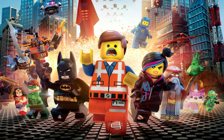
A year later it was go again; BWC was going global, the experience was getting a few new features and the designs were updated. Once again we worked closely with North Kingdom who came up with a concept of a game mode, where the goal was to become a Master Builder. BWC v2 was released as promotion both for the WebGL capacities in Google Chrome as well as the new LEGO the Movie feature film.

Multiple modes
Today, Build with Chrome is now open for the entire world to explore on top of Google Maps, and it’s even accessible on all WebGL enabled phones, tablets, and computers that allows anyone the opportunity to build something awesome.
The application is loosely divided into four different sections: Build mode, Explore mode, Academy mode and CMS for the LEGO people to keep an eye on all of the creations.
Explore all builds
Entering the Explore mode the user is shown a view of their current geographic location, populated with markers to indicate where people have built their LEGO-structures. Using a zoom control, the user can zoom in on any geographic spot to view the creations in WebGL 3D. We used Google Maps' API to present the world, where each tile of from the API equaled one baseplate - the unit each user is given upon entering Build mode. Users can either specifically select a base plate in 3D mode, or get one randomly assigned based on their geographical location. We did HTML-templates, javascript, CSS and API integrations.
The application uses Google+ authentication so users who sign in can view builds created by people in their circles and revisit builds they've liked using the +1 feature.
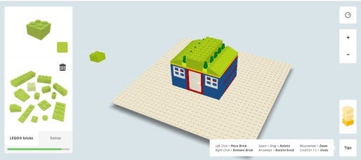
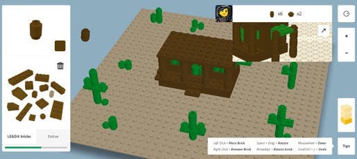
Build something awesome
In Build mode the user is presented with their chosen baseplate on which they are free to create whatever they want with a bunch of LEGO-bricks in different shapes and colours. We were responsible for the UI; rotating bricks, changing colour and brick types, saving and publishing. We worked closely with programmers at NK who did the actual WebGL code, while we created HTML-templates, CSS and AJAX API calls to save people's builds.

Become a master builder
Academy consists of a series of challenges of increasing difficulty. This is where you train to become a Master Builder! Starting with the basics, you'll face a series of building challenges in different locations. Before you know it you'll be building complex magical worlds of your own. The user is to follow a set of instructions (much as in building with regular LEGO), learning a number of different building techniques, eventually gaining the title of Master builder.

Keeping up with the swastikas
LEGO needed to be able to remove inappropriate content, which is why we created a flagging system accessible from Explore mode. In the CMS the moderators can review all builds created, and work through the ones that have been flagged by users of the application. There is also some statistics and a section to translate the whole application to an unlimited number of languages (currently the application is available in 27 languages).
Build with Chrome at Google I/O 2014
For Google I/O 2014 the Build world got physical in a monter at the exhibition area. Some poor bastard spent a day building the booth with loads of LEGO bricks. We were not that poor bastard. However we did use WebRTC to create a versus mode out of academy. Two Chromebook Pixels at the booth presented the users with a challenge where you competed against your friend (or total random stranger) to see who could complete the instruction steps the fastest. It was, of course, in real time and it was also simultaneously displayed on a huge LED-screen so that all the people around could watch the contestants battle it out. It was a really cool project, we just wish we too could have gone over to the US to enjoy it IRL.

Conclusion
This project cannot be called anything other than a success; at the time of writing there are 678 394 different builds in the Build with Chrome world and the site has had literally millions of visitors. We learned lots.

LEGO and Google Chrome linked up to create "Build with Chrome", a social online building website that lets users build anything anywhere with an infinite number of Lego blocks -- virtual Lego blocks.
First developed as an experiment by a LEGO-loving team in Australia, Build with Chrome was based on the idea of bringing the classic plastic toy bricks to the digital realm. The website uses 3D graphic technology called WebGL that lets the virtual Lego bricks work like the real ones.
Once you're on the website, you can pick your plot anywhere or explore the "world of Build", which has a Google Maps interface. You can also start building your own project right away and publish or share it with friends.
If you already have a Google+ account, the Build Academy lets you master your LEGO building skills online through tutorials guided by characters from the upcoming LEGO film and completing tasks. The tasks grow more elaborate as you learn more tricks.
Even if it's not the same experience, virtual LEGO building seems to take just as long as it does with real LEGOs as you rummage through the virtual toolbox, but it can actually be quite fun as you get used to the controls.
Build with Chrome has its marketing perks, too. It helps promote the Feb. 7 release of "The LEGO Movie" while also tempting more people to sign up for Google+ accounts and test out the Chrome browser. And of course, the website makes playing with LEGOs more accessible. In other words, another wonderful Internet distraction.
Читайте также: